
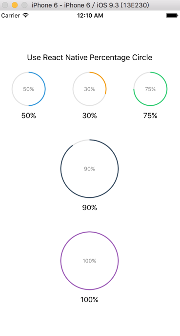
先放运行截图说明做什么吧,
react-native-percentage-circle 项目地址
最近需求需要一个显示百分比的加载条。然而去搜索了很久,没能发现比较满意的组件,只好自己解决了。当然对于大多数前端而言,这个并不是特别难的,可能思路众多,然而面对React Native似乎就有点相形见绌了。解决这样的问题,我们还是得回归前端本身,看看有什么可以嫁接的方案没。
前端常规制作进度条方法
前端实现相对容易点,我们可以用canvas去绘制圆,也可以用SVG去绘制.
使用SVG
<svg style="width:2.8rem" version="1.1" xmlns="http://www.w3.org/2000/svg" xmlns:xlink="http://www.w3.org/1999/xlink" x="0px" y="0px" viewBox="0 0 130 130" overflow="visible" enable-background="new 0 0 130 130" id="progress">
	<circle fill="none" stroke="#ccc" stroke-width="4" stroke-miterlimit="10" cx="64.8" cy="64.8" r="59.8"></circle>
	<circle class="styled" fill="none" stroke="#2ecc71" stroke-width="4" stroke-miterlimit="10" cx="64.8" cy="64.8" r="59.8" style="stroke-dashoffset: -93.9336; stroke-dasharray: 375.734;"></circle>

 </svg>
SVG主要是用Circle进行绘制,关于Circle使用可以看 这里 。我们先绘制第一个圆,用于底色。接下来我们只需要在上面绘制一个带有色彩的圆(切记不要填充颜色fill="none")。这个时候我们需要了解两个关键的属性;
stroke-dasharray: 用于控制路径绘制中虚线和间距的。例子中的即圆的周长。
stroke-dashoffset: 用于指定距离虚线绘制的起点
如果我们知道了这个的话,我们只需要计算出圆的周长
var CircleLength = R * 2 * Math.PI;

var PercentOffset = - CircleLength * yourPercent;
然后将这个第二个Circle属性赋予到style中:
style="stroke-dashoffset: -93.9336; stroke-dasharray: 375.734;"
SVG相对来说还算是比较易用的解决方案, Demo;
使用 CSS渐变
还有一个更加直接的方法,就是利用 CSS3 中的linear-gradient:
效果如图:
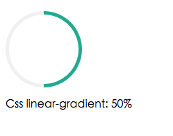
我们只需要指定line-grdient中通过旋转的角度然后设置好间隔的渐变百分比就行啦。
background-image:linear-gradient(90deg, transparent 50%, #16a085 50%), linear-gradient(90deg, #eee 50%, transparent 50%);
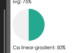
下图为隐藏掉遮挡的小圆的样子。
代码如下:
.circle1{
  position:relative;
  width:110px;
  height:110px;
  border-radius:100%;
  background-color: #eee;
  background-image:linear-gradient(90deg, transparent 50%, #16a085 50%),     linear-gradient(90deg, #eee 50%, transparent 50%);
 }
.circle2{
  position:relative;
  top:5px;
  left:5px;
  width:100px;
  height:100px;
  border-radius:100%;
  background-color: #fff;
}
<div class="circle1">
	<div class="circle2"></div>
</div>
使用CSS Transform
如果要用Transform 的话,这个脑洞就比较大了,解决的方案也有很多,今天自己分享一个相对不烧脑的解决方案:
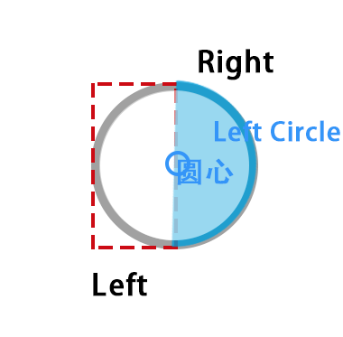
图3-1
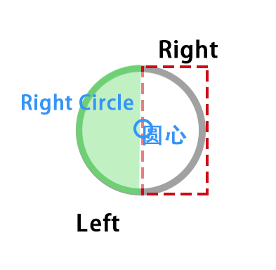 图3-2
图3-2
如图 我们需要建立一个外部的圆,也就是用于绘制灰色的底色,然后再用一个区域进行层级遮挡(也可以自己用border来模拟啦)。记住属性一定要有overflow:hidden.
接下来我们需要添加左右两个分区,用于放置进行彩条绘制的容器。如图3-1我们设置左分区一个,里面是一个左半圆,而这个半圆距离容器距离是100%,默认是不可见的。然后它需要围绕圆心旋转,比较巧妙的是,它需要旋转过180度后,才会回到它的父容器可见区域。如图3-2同理我们可以设置右半区,然后将半圆放在-100%的距离,即右半圆默认也不可见的。当它开始旋转的时候即如下图红色区域就是我们的角度:

注意由于是两个圆进行配合,因此角度过180度,时候,左半圆则开始旋转,而右半圆则保持180度即可。
.left-wrap{
	overflow: hidden;
	position: absolute;
	left:0;
	top:0;
	width: 50%;
	height:100%;

}
.left-wrap .loader{
	position: absolute;
	left:100%;
	top:0;
	width:100%;
	height:100%;
	border-radius: 1000px;
	background-color: #333;
	border-top-left-radius: 0;
	border-bottom-left-radius: 0;
	transform-origin:0 50% 0;
}
// 省略一些右半区代码

.right-wrap{
	....
	left:50%;
}
.right-wrap .loader{
	...
	left:-100%;
	border-bottom-right-radius: 0;
	border-top-right-radius: 0;
	transform-origin:100% 50% 0;
}
这些就是前端的一些解决方法当然你也可以选择开源的框架,比如:
如何使用React Native写这样的进度条呢?
前面的前端思路自己倒是有了,于是觉得很easy嘛,不过在开始写的时候发现 尴尬了。 SVG成本比较大,你需要安装依赖react-native-art-svg。用渐变的话,当然也比较麻烦,也需呀安装依赖,自己内心觉得:画一个圆至于么!!!
于是乎开始自己造轮子了,采用了第三种方案,就用view + transform进行组件封装。才开始还挺顺的,不过看官方文档,发现没有对 transform origin支持。虽然支持了rotate ,scale,translate,但是发现这个缺陷,无疑陷入一丝困境。随后发现有人早已提了自己的pr给官方,希望得到支持。类似于 transformOrgin:{x:100}这样子。 当然目前最新版依旧没有纳入到计划中。不过官方支持了transformMatrix , 这个虽好,可是楼主数学却是渣,能不能有一个让学渣快速理解的方案。
The transform-origin property lets you modify the origin for transformations of an element. For example, the transform-origin of the rotate() function is the centre of rotation. (This property is applied by first translating the element by the negated value of the property, then applying the element's transform, then translating by the property value.)
大致意思就是这个属性在进行选择时指定origin的时候,会先将元素平移过去,然后再移回来。所以我们可以在旋转时这样指定:
<View style={[styles.leftWrap,{
  // ....
  <View style={[styles.loader,{
     ...  radius: 半径
     transform:[{translateX:-this.props.radius/2},{rotate:this.state.leftTransformerDegree},{translateX:this.props.radius/2}],
     }]}></View>
 </View>
这样自己就可以解决transform origin的问题了。这样写进度就非常easy 啦。自己简单封装了这个组件 react-native-percentage-circle
简单开始:
npm i react-native-percentage-circle --save
import PercentageCircle from 'react-native-percentage-circle';

//...

redner() {
  <View>
    <PercentageCircle radius={35} percent={50} color={"#3498db"}></PercentageCircle>
  </View>
}
选项说明
| Props | Type | Example | Description |
|---|---|---|---|
| color | string | '#000' | 进度条颜色 |
| percent | Number | 30 | 百分之多少 |
| radius | Number | 20 | 圆的半径 |
当然目前的参数自己想到的就这些,当然大家可以自己写,也可以提PR ,将它扩展。